Quantcast
Channel: CoderzHeaven
Viewing all 526 articles
Browse latest View live

#Flutter Tutorial – Select an image from Gallery and show in Imageview

$
0
0

For selecting an image from the Gallery or Camera roll in Flutter, we need to include a library in pubspec.yaml file under the dependencies that is present in the root of your project.

Demo Video


Watch Video Tutorial


dependencies:
  flutter:
    sdk: flutter
....

  image_picker: ^0.4.10
.....

 
Usage

 
To open the gallery
 

Future<File> imageFile;

 //Open gallery
  pickImageFromGallery(ImageSource source) {
    setState(() {
      imageFile = ImagePicker.pickImage(source: source);
    });
  }
....

 
Show Image in the UI
 

Once the user selects the image, show it in the UI.

The below method will update UI, once the user selects the image.

Widget showImage() {
    return FutureBuilder<File>(
      future: imageFile,
      builder: (BuildContext context, AsyncSnapshot<File> snapshot) {
        if (snapshot.connectionState == ConnectionState.done &&
            snapshot.data != null) {
          return Image.file(
            snapshot.data,
            width: 300,
            height: 300,
          );
        } else if (snapshot.error != null) {
          return const Text(
            'Error Picking Image',
            textAlign: TextAlign.center,
          );
        } else {
          return const Text(
            'No Image Selected',
            textAlign: TextAlign.center,
          );
        }
      },
    );
  }


Complete Example

import 'package:flutter/material.dart';
import 'package:image_picker/image_picker.dart';
import 'dart:io';

class PickImageDemo extends StatefulWidget {
  PickImageDemo() : super();

  final String title = "Flutter Pick Image demo";

  @override
  _PickImageDemoState createState() => _PickImageDemoState();
}

class _PickImageDemoState extends State<PickImageDemo> {
  Future<File> imageFile;

  pickImageFromGallery(ImageSource source) {
    setState(() {
      imageFile = ImagePicker.pickImage(source: source);
    });
  }

  Widget showImage() {
    return FutureBuilder<File>(
      future: imageFile,
      builder: (BuildContext context, AsyncSnapshot<File> snapshot) {
        if (snapshot.connectionState == ConnectionState.done &&
            snapshot.data != null) {
          return Image.file(
            snapshot.data,
            width: 300,
            height: 300,
          );
        } else if (snapshot.error != null) {
          return const Text(
            'Error Picking Image',
            textAlign: TextAlign.center,
          );
        } else {
          return const Text(
            'No Image Selected',
            textAlign: TextAlign.center,
          );
        }
      },
    );
  }

  @override
  Widget build(BuildContext context) {
    return Scaffold(
      appBar: AppBar(
        title: Text(widget.title),
      ),
      body: Center(
        child: Column(
          mainAxisAlignment: MainAxisAlignment.center,
          children: <Widget>[
            showImage(),
            RaisedButton(
              child: Text("Select Image from Gallery"),
              onPressed: () {
                pickImageFromGallery(ImageSource.gallery);
              },
            ),
          ],
        ),
      ),
    );
  }
}

 
Thats it.

Please leave your valuable comments below.


Flutter Tutorials – AutoComplete TextField

$
0
0

Hi,

Today, I will show you how you can implement AutoComplete TextField in Flutter.

Watch Demo

 
Watch Video Tutorial


Add Library
 
You can get the Flutter AutoCompleteTextField Library from below link
 
https://pub.dartlang.org/packages/autocomplete_textfield
 
Get the package name and add it in the pubspec.yaml file add the dependency. We will also add the http library for the service calls we are going to make.

dependencies:
  flutter:
    sdk: flutter
  .....
  http: "0.11.3+17"
  autocomplete_textfield: ^1.6.4
  ...


Get the Data for AutoComplete.

We will be getting the data for showing in the Autocomplete from below url.

https://jsonplaceholder.typicode.com/users

This will return a list of users in JSON format. We will consume the data, parse it and show it in our AutoComplete TextField.

Model Class

We are going to create a model class for the Users coming from the Service.
For this example, I am using only the id, name and email for each user from the service.

Create a new file named “user.dart”. Create a class User and create the Constructor.
We will have one more method to parse a user json object and map it to a User Object.

Let’s create the class and it’s methods.

user.dart


class User {
  int id;
  String name;
  String email;

  User({this.id, this.name, this.email});

  factory User.fromJson(Map<String, dynamic> parsedJson) {
    return User(
      id: parsedJson["id"],
      name: parsedJson["name"] as String,
      email: parsedJson["email"] as String,
    );
  }
}

Call the Service

I am going to write a method getUsers() that fetches the users from the Service and load the user list.

The below two methods does that. This goes to our mail file.

void getUsers() async {
    try {
        final response =
            await http.get("https://jsonplaceholder.typicode.com/users");
        if (response.statusCode == 200) {
        users = loadUsers(response.body);
        print('Users: ${users.length}');
        setState(() {
            loading = false;
        });
        } else {
        print("Error getting users.");
        }
    } catch (e) {
        print("Error getting users.");
    }
}

static List<User> loadUsers(String jsonString) {    
    final parsed = json.decode(jsonString).cast<Map<String, dynamic>>();
    return parsed.map<User>((json) => User.fromJson(json)).toList();
}

Once this service executes, we will get the list of users.

 
Row for AutoCompleteTextField

Write a method to return the view for each row of the AutoComplete TextField.

 Widget row(User user) {
    return Row(
      mainAxisAlignment: MainAxisAlignment.spaceBetween,
      children: <Widget>[
        Text(
          user.name,
          style: TextStyle(fontSize: 16.0),
        ),
        SizedBox(
          width: 10.0,
        ),
        Text(
          user.email,
        ),
      ],
    );
  }


Build the UI


Let’s write the UI that has the AutoCompleteTextField.

@override
  Widget build(BuildContext context) {
    return Scaffold(
      appBar: AppBar(
        title: Text(widget.title),
      ),
      body: Column(
        mainAxisAlignment: MainAxisAlignment.start,
        children: <Widget>[
          loading
              ? CircularProgressIndicator()
              : searchTextField = AutoCompleteTextField<User>(
                  key: key,
                  clearOnSubmit: false,
                  suggestions: users,
                  style: TextStyle(color: Colors.black, fontSize: 16.0),
                  decoration: InputDecoration(
                    contentPadding: EdgeInsets.fromLTRB(10.0, 30.0, 10.0, 20.0),
                    hintText: "Search Name",
                    hintStyle: TextStyle(color: Colors.black),
                  ),
                  itemFilter: (item, query) {
                    return item.name
                        .toLowerCase()
                        .startsWith(query.toLowerCase());
                  },
                  itemSorter: (a, b) {
                    return a.name.compareTo(b.name);
                  },
                  itemSubmitted: (item) {
                    setState(() {
                      searchTextField.textField.controller.text = item.name;
                    });
                  },
                  itemBuilder: (context, item) {
                    // ui for the autocomplete row
                    return row(item);
                  },
                ),
        ],
      ),
    );
  }


itemBuilder : Returns view for each row.
itemSubmitted: Returns when user submits the query.
itemFilter: Filters the user query from the list of users.
itemSorter: Compares each values in the list and sort.

 
Here we are using some variables that needs to be declared

 
1. loading : show loading until the service finishes.
2. searchTextField: Handle for AutoCompleteTextField.
3. key: Global Key for the AutoCompleteTextField.
 

Declarations
 

 AutoCompleteTextField searchTextField;
 GlobalKey<AutoCompleteTextFieldState<User>> key = new GlobalKey();
 static List<User> users = new List<User>();
 bool loading = true;

 
Complete Example

import 'package:flutter/material.dart';
import 'package:http/http.dart' as http;
import 'user.dart';
import 'dart:convert';
import 'package:autocomplete_textfield/autocomplete_textfield.dart';

class AutoCompleteDemo extends StatefulWidget {
  AutoCompleteDemo() : super();

  final String title = "AutoComplete Demo";

  @override
  _AutoCompleteDemoState createState() => _AutoCompleteDemoState();
}

class _AutoCompleteDemoState extends State<AutoCompleteDemo> {
  AutoCompleteTextField searchTextField;
  GlobalKey<AutoCompleteTextFieldState<User>> key = new GlobalKey();
  static List<User> users = new List<User>();
  bool loading = true;

  void getUsers() async {
    try {
      final response =
          await http.get("https://jsonplaceholder.typicode.com/users");
      if (response.statusCode == 200) {
        users = loadUsers(response.body);
        print('Users: ${users.length}');
        setState(() {
          loading = false;
        });
      } else {
        print("Error getting users.");
      }
    } catch (e) {
      print("Error getting users.");
    }
  }

  static List<User> loadUsers(String jsonString) {
    final parsed = json.decode(jsonString).cast<Map<String, dynamic>>();
    return parsed.map<User>((json) => User.fromJson(json)).toList();
  }

  @override
  void initState() {
    getUsers();
    super.initState();
  }

  Widget row(User user) {
    return Row(
      mainAxisAlignment: MainAxisAlignment.spaceBetween,
      children: <Widget>[
        Text(
          user.name,
          style: TextStyle(fontSize: 16.0),
        ),
        SizedBox(
          width: 10.0,
        ),
        Text(
          user.email,
        ),
      ],
    );
  }

  @override
  Widget build(BuildContext context) {
    return Scaffold(
      appBar: AppBar(
        title: Text(widget.title),
      ),
      body: Column(
        mainAxisAlignment: MainAxisAlignment.start,
        children: <Widget>[
          loading
              ? CircularProgressIndicator()
              : searchTextField = AutoCompleteTextField<User>(
                  key: key,
                  clearOnSubmit: false,
                  suggestions: users,
                  style: TextStyle(color: Colors.black, fontSize: 16.0),
                  decoration: InputDecoration(
                    contentPadding: EdgeInsets.fromLTRB(10.0, 30.0, 10.0, 20.0),
                    hintText: "Search Name",
                    hintStyle: TextStyle(color: Colors.black),
                  ),
                  itemFilter: (item, query) {
                    return item.name
                        .toLowerCase()
                        .startsWith(query.toLowerCase());
                  },
                  itemSorter: (a, b) {
                    return a.name.compareTo(b.name);
                  },
                  itemSubmitted: (item) {
                    setState(() {
                      searchTextField.textField.controller.text = item.name;
                    });
                  },
                  itemBuilder: (context, item) {
                    // ui for the autocompelete row
                    return row(item);
                  },
                ),
        ],
      ),
    );
  }
}

All Done.

Please leave your valuable comments below.

Efficient use of Widgets in Flutter Container – Tip

$
0
0


I am going to show how to efficiently make use of widgets in Flutter.

This is a simple example of how to work with widgets in Flutter.

Here we will be creating two widgets that looks similar, but let’s see how many hierarchies or levels of widgets are needed to create such a widget.

 
Watch Video Tutorial

 
Let’s start then…

 
We will write a function that returns the widget.


 Widget myWidget1() {
    return 
        Padding(
            padding: const EdgeInsets.all(10.0),
            child: Container(
            color: Colors.white,
            width: double.infinity,
            child: Center(
                child: Padding(
                padding: EdgeInsets.all(20.0),
                child: Text("Widget 1"),
                ),
            ),
            ),
        );
}


The Above widget will look like this in the UI.

Widget 1

Widget 1


Now we will create the same widget with the same look and feel with less hierarchies, that means less number of widgets.

I will write another function for that.


Widget myWidget2(){
    return Container(
        margin: EdgeInsets.all(10.0),
        padding: EdgeInsets.all(20.0),
        color: Colors.white,
        alignment: Alignment.center,
        child: Text("Widget 2"),
    );
}


Now if you add the second widget also to the UI, both will have the same appearance, but with less widgets for second one.


 Widget 1 & Widget 2

Widget 1 & Widget 2


So thats the power of Container. I believe this will be a good information when you code in Flutter.

Make sure to subscribe to my youtube channel for more Video Tutorials.

Here is one of my Tutorials link.

Please leave your valuable comments below so that it will be an encouragement for me to write more articles and videos.

Bottomsheets in Flutter – Android and iOS

$
0
0

This demo shows how you can implement bottom sheets in flutter which works for both Android and iOS.

 
The StatefulWidget has a built-in function called “showModalBottomSheet’ which we will implement to show a bottom sheet.
 
Watch Video Tutorial


Modal Bottom Sheet
 

Modal Bottom Sheet in Flutter

Modal Bottom Sheet in Flutter


The below function implements a bottom sheet which shows like a modal, that means it will be dismissed when you tap anywhere on the screen outside the sheet.


openBottomSheet(BuildContext context) {
    showModalBottomSheet(
        context: context,
        builder: (BuildContext context) {
          return Column(
            mainAxisSize: MainAxisSize.min,
            children: <Widget>[
              ListTile(
                leading: Icon(Icons.photo),
                title: Text("Photos"),
                onTap: () {},
              ),
              ListTile(
                leading: Icon(Icons.camera),
                title: Text("Camera"),
                onTap: () {},
              ),
              ListTile(
                leading: Icon(Icons.videocam),
                title: Text("Video"),
                onTap: () {},
              ),
            ],
          );
        });
  }


This will take the BuildContext parameter which you can pass from the build function.


Persistent Bottom Sheet


Persistent Bottom Sheet in Flutter

Persistent Bottom Sheet in Flutter


We have to create a GlobalState<ScaffoldState> and a PersistentBottomSheetController instance to create a persistent Bottom sheet across the screens.


Declare the variables


final scaffoldKey = GlobalKey<ScaffoldState>();
PersistentBottomSheetController controller;


Let’s write the function that shows a Persistent Bottom Sheet.


openPersistentBottomController(BuildContext context) {
    controller =
        scaffoldKey.currentState.showBottomSheet((BuildContext context) {
      return Container(
        padding: EdgeInsets.all(30.0),
        color: Colors.green,
        child: Column(
          mainAxisSize: MainAxisSize.min,
          children: <Widget>[
            Text("Persistent Bottom Bar"),
            SizedBox(
              height: 20,
            ),
            Text(
              "This is a simple demo of flutter persistent bottom sheet",
              style: TextStyle(fontSize: 20),
            ),
          ],
        ),
      );
    });
  }


Don’t forget to add the key to the Scaffold that is calling this function.


@override
  Widget build(BuildContext context) {
    return Scaffold(
      key: scaffoldKey,
...


Make sure you assign the controller…


  controller =
        scaffoldKey.currentState.showBottomSheet((BuildContext context) {
....


That’s it. It’s that simple in Flutter.

Flutter Tutorials – Navigation Drawer in Flutter – Android and iOS

$
0
0

Today we will see how we can implement a Navigation Drawer in Flutter.
In Flutter, its easy, so Lets start…


Navigation Drawer Flutter

Navigation Drawer Flutter

Watch Video Tutorial


Navigation Drawer can be added as part of the Scaffold Widget. The Scaffold widget has a ‘drawer’ property on to which you can
add the drawer. This simple example below demonstrates that.

 
Here I will be adding some children to the drawer, basically a DrawerHeader, and three List Tiles.
The DrawerHeader can take its own child and you can customize the way you want. In this example I will be adding
an image, a SizedBox(for some spacing) and a Text widget.

 
Let’s jump into the code.
I believe the code is self explanatory, so I am not going into unnecessary details.

 
Complete Code

import 'package:flutter/material.dart';

class NavigationDrawerDemo extends StatefulWidget {
  NavigationDrawerDemo() : super();

  final String title = "Navigation Drawer Demo";

  @override
  _NavigationDrawerDemoState createState() => _NavigationDrawerDemoState();
}

class _NavigationDrawerDemoState extends State<NavigationDrawerDemo> {
  @override
  Widget build(BuildContext context) {
    return Scaffold(
      drawer: Drawer(
        child: ListView(
          padding: EdgeInsets.zero,
          children: <Widget>[
            DrawerHeader(
              child: Column(
                mainAxisSize: MainAxisSize.min,
                mainAxisAlignment: MainAxisAlignment.center,
                children: <Widget>[
                  Image.asset('images/flutter.jpg',
                  width: 80,
                  height: 80,),
                  SizedBox(height: 15,),
                  Text("name",
                  style: TextStyle(color: Colors.grey),)
                ],
              ),
              decoration: BoxDecoration(
                color: Colors.white,
              ),
            ),
            ListTile(
              leading: Icon(Icons.add_to_photos),
              title: Text('Add to Photos'),
              onTap: () {
                Navigator.pop(context);
              },
            ),
            ListTile(
              leading: Icon(Icons.add_alarm),
              title: Text('Alarm'),
              onTap: () {
                Navigator.pop(context);
              },
            ),
            
          ],
        ),
      ),
      appBar: AppBar(
        title: Text(widget.title),
      ),
      body: Center(
        child: Column(
          mainAxisAlignment: MainAxisAlignment.center,
          children: <Widget>[],
        ),
      ),
    );
  }
}

 
Close the Drawer
 

To close the drawer call

 
Navigator.pop(context);

Flutter Tutorials – Inherited Widgets

$
0
0

Today we are going to see how to use inherited widgets in Flutter.

You may have seen ‘Theme.of(context)’ in one some Flutter applications or you might have used it. The thing is ‘Theme’ is available for the whole application and in every widget correct?
We are going to do something like that and share data across the application. Here we will be sharing a user across our two screens (A HomeScreen and a FormScreen). Let’s jump in…

Demo

Below is the demo of the app we are going to build.


Watch Video Tutorials


Problem:
 

Let’s say you have a lot of widgets(Screens) in your application and you want to pass data between widgets. Of course you can pass data between screens using their constructor, but what if there are a lot of widgets, it becomes a mess correct!!. It will be more complex, isn’t it?

But you may want to pass the data from the last widget you added and update in the First Home Widget. How to do that? Inherited Widgets can come to the rescue. This is one of the ways you can do State management of your complete application.

We can make the Inherited widget, the root of our application and set the data in that root widget, so that i can pass data to the widgets under it and vice-versa.

The below diagrams explains the above scenario.

Here I am going to create two Screens, First HomeScreen and other the FormScreen and we are going to send the name typed in the form in the FormScreen to the HomeScreen.

User

We are going to have a user object in our app. To keep it simple I am just providing ‘name’ as the member.

Create a new file named “user.dart’ and contents will be…

class User {
  String name;
  User({this.name});
}

State Container – inherited Widget.

Below is the code for the inherited widget that contains the data saved by the FormScreen. Create a new file named “state_container.dart’ and copy the below code.
Let’s see the complete code first and then I will explain one by one.

import 'package:flutter/material.dart';
import 'user.dart';

class StateContainer extends StatefulWidget {
  final Widget child;
  final User user;

  StateContainer({@required this.child, this.user});

  static StateContainerState of(BuildContext context) {
    return (context.inheritFromWidgetOfExactType(InheritedStateContainer)
            as InheritedStateContainer)
        .data;
  }

  @override
  StateContainerState createState() => new StateContainerState();
}

class StateContainerState extends State<StateContainer> {
  User user;

  void updateUser({name}) {
    if (user == null) {
      user = new User(name: name);
      setState(() {
        user = user;
      });
    } else {
      setState(() {
        user.name = name ?? user.name;
      });
    }
  }

  @override
  Widget build(BuildContext context) {
    return InheritedStateContainer(
      data: this,
      child: widget.child,
    );
  }
}

class InheritedStateContainer extends InheritedWidget {
  final StateContainerState data;
  InheritedStateContainer({
    Key key,
    @required this.data,
    @required Widget child,
  }) : super(key: key, child: child);

  @override
  bool updateShouldNotify(InheritedWidget oldWidget) => true;
}

I am gonna explain how we are going to use it below.

Here we have two Widgets, one is the ‘StateContainer’ class and other one is the ‘InheritedStateContainer’ which is the actual widget that inherits the InheritedWidget.

We will be using the ‘InheritedStateContainer‘ inside the ‘StateContainer‘ Widget.

Take a look at the below function in the StateContainer.

 static StateContainerState of(BuildContext context) {
    return (context.inheritFromWidgetOfExactType(InheritedStateContainer)
            as InheritedStateContainer)
        .data;
  }
...

You can have any name for this function, but to make it look similar to the inbuilt inherited widget ‘Theme.of(context)’. We are going to make the user available to the whole application…Correct!!?

Root Widget

The main thing you have to do is to make the inherited widget, the root widget of the application. So our main.dart file will look like this.

import 'package:flutter/material.dart';
import 'inherited_widgets/demo/homescreen.dart';

void main() {
  runApp(
    new HomeApp(),
  );
}

class HomeApp extends StatelessWidget {
  @override
  Widget build(BuildContext context) {
    return new MaterialApp(
      title: 'Inherited Widget Demo',
      home: new HomeScreen(),
    );
  }
}

HomeScreen (First Screen)

This is our Homescreen, one of the screens that I talked about earlier. Let’s look at the code of the HomeScreen

import 'package:flutter/material.dart';
import 'package:flutter_demo1/inherited_widgets/demo/myform.dart';
import 'package:flutter_demo1/inherited_widgets/demo/state_container.dart';
import 'user.dart';

class HomeScreen extends StatefulWidget {
  @override
  HomeScreenState createState() => new HomeScreenState();
}

class HomeScreenState extends State<HomeScreen> {
  User user;

  openForm(BuildContext context) {
    // Open Form
    Navigator.push(
      context,
      new MaterialPageRoute(
          fullscreenDialog: true,
          builder: (context) {
            return new FormScreen();
          }),
    );
  }

  @override
  Widget build(BuildContext context) {
    final container = StateContainer.of(context);
    user = container.user;

    return new Scaffold(
        appBar: new AppBar(
          title: new Text('Flutter Inherited Widget Demo'),
        ),
        body: Container(
          alignment: Alignment.center,
          child: Column(
            mainAxisAlignment: MainAxisAlignment.center,
            crossAxisAlignment: CrossAxisAlignment.center,
            children: <Widget>[
              user != null ? Text('Name:${user.name}') : Text("No Name"),
              SizedBox(
                height: 20.0,
              ),
              RaisedButton(
                child: Text("Add Name"),
                onPressed: () {
                  openForm(context);
                },
              )
            ],
          ),
        ));
  }
}

We are declaring a User object in the HomeScreen and accessing the State from the StateContainer like this.

final container = StateContainer.of(context);
    user = container.user;
...

onPress of the button in the HomeScreen, we will open the FormScreen.


FormScreen (Second Screen)


Our FormScreen just has a TextFormField that takes the values typed by the user and saves it in our Inherited Widget.

Let’ see whats the code for FormScreen look like.

import 'package:flutter/material.dart';
import 'package:flutter_demo1/inherited_widgets/demo/state_container.dart';

class FormScreen extends StatefulWidget {
  @override
  FormScreenState createState() => new FormScreenState();
}

class FormScreenState extends State<FormScreen> {
  String name;
  final formKey = new GlobalKey<FormState>();

  validateAndSave() {
    final container = StateContainer.of(context);

    if (formKey.currentState.validate()) {
      formKey.currentState.save();
      container.updateUser(name: name);
      Navigator.pop(context);
    } else {
      print("Validation Error");
    }
  }

  @override
  Widget build(BuildContext context) {
    return new Scaffold(
      appBar: new AppBar(
        title: new Text('Flutter Inherited Widget Demo'),
      ),
      body: Form(
        key: formKey,
        child: Padding(
          padding: EdgeInsets.all(20.0),
          child: Container(
            alignment: Alignment.center,
            child: Column(
              mainAxisAlignment: MainAxisAlignment.center,
              crossAxisAlignment: CrossAxisAlignment.center,
              children: <Widget>[
                TextFormField(
                  keyboardType: TextInputType.text,
                  decoration: InputDecoration(labelText: "Name"),
                  validator: (val) => val.length == 0 ? "Enter Name" : null,
                  onSaved: (val) => name = val,
                ),
                RaisedButton(
                  child: Text("Save"),
                  onPressed: validateAndSave,
                )
              ],
            ),
          ),
        ),
      ),
    );
  }
}


Here also, we will be accessing the function that we wrote in the StateContainer to save the user to the state of our Inherited Widget (the StateContainer).


Note : The important thing to note is that the state object (here user) is immutable in the StateContainer, so we will be creating if it is null and updating it when it is not null.

 
Check the StateContainer updateUser function.


User user;

  void updateUser({name}) {
    if (user == null) {
      user = new User(name: name);
      setState(() {
        user = user;
      });
    } else {
      setState(() {
        user.name = name ?? user.name;
      });
    }
  }


So when someones types something in the FormScreen, it is saved in our StateContainer inherited Widget State and we will access it using


StateContainer.of(context);

 
So now our ‘user’ is shared across the screens in our app.
Happy Coding. 🙂


Flutter Tutorial – Enable/Disable Any Widget – Android and iOS.

$
0
0

Today, I will introduce to a new widget in Flutter with which you can enable or disable any widget in Flutter.


If you wrap any widget in Flutter with the AbsorbPointer Widget, you can enable or disable that widget. That means if you wrap your whole UI in AbsorbPointer Widget, then you can control the user interaction on that UI by toggling the ‘absorbing’ property of AbsorbPointer Widget. When ‘absorbing‘ is true, the AbsorbPointer Widget absorbs all interaction in the widget’s child and in a way disabling it.


Let’s jump into the code.


The below code has three buttons, up on enabling the ‘absorbing‘ to false, all the buttons will be disabled at the same time and vice-versa.


Watch Video Tutorial


Below is the sample code


import 'package:flutter/material.dart';

class Tip2 extends StatefulWidget {
  Tip2() : super();

  final String title = "Tip Demo";

  @override
  Tip2State createState() => Tip2State();
}

class Tip2State extends State<Tip2> {
  @override
  Widget build(BuildContext context) {
    return Scaffold(
        appBar: AppBar(
          title: Text(widget.title),
        ),
        body: AbsorbPointer(
          absorbing: false,
          child: Column(
            mainAxisAlignment: MainAxisAlignment.start,
            children: <Widget>[
              RaisedButton(
                child: Text("Click Me"),
                onPressed: () {},
              ),
              RaisedButton(
                child: Text("Click Me"),
                onPressed: () {},
              ),
              RaisedButton(
                child: Text("Click Me"),
                onPressed: () {},
              )
            ],
          ),
        ));
  }
}

 
Take a look at this line above


AbsorbPointer(
          absorbing: false,
...

 
Please leave your valuable comments below.

Thanks.


#Flutter Tutorials – Shared Element Transition (Hero Widgets) – Android & iOS.

$
0
0

Shared Element transitions are native in Android, but with Flutter you can do the same UI transition with Flutter as well.


Watch Video Tutorial


Hero Widgets


Shared element transitions can be achieved in Flutter with the help of Hero Widgets.


Here I have two Screens, one is called ScreenOne and other DetailsScreen.
ScreeOne has a small image and a button below it. On Clicking the button, we will open the Details screen with the Shared Element transition. You can see the demo if you watch the above tutorial.


ScreenOne


import 'package:flutter/material.dart';
import 'package:flutter_demo1/transition/details.dart';

class ScreenOne extends StatefulWidget {
  ScreenOne() : super();

  final String title = "Screen One";

  @override
  _ScreenOneState createState() => _ScreenOneState();
}

class _ScreenOneState extends State<ScreenOne> {
  goToDetails(BuildContext context) {
    Navigator.push(
      context,
      new MaterialPageRoute(
          fullscreenDialog: true,
          builder: (BuildContext context) => new DetailsScreen()),
    );
  }

  @override
  Widget build(BuildContext context) {
    return Scaffold(
      appBar: AppBar(
        title: Text(widget.title),
      ),
      body: Container(
        color: Colors.green,
        padding: EdgeInsets.all(30.0),
        alignment: Alignment.center,
        child: Column(
          mainAxisAlignment: MainAxisAlignment.center,
          children: <Widget>[
            Hero(
              tag: "image1",
              child: ClipOval(
                child: Image.asset(
                  "images/flutter.jpg",
                  width: 200,
                  height: 200,
                ),
              ),
            ),
            SizedBox(
              height: 30.0,
            ),
            OutlineButton(
              child: Text(
                "Show Full  Image",
                style: TextStyle(color: Colors.white),
              ),
              padding: EdgeInsets.all(20.0),
              onPressed: () {
                goToDetails(context);
              },
            )
          ],
        ),
      ),
    );
  }
}


The ‘goToDetails()‘ function will open the DetailsScreen.
Look at the image in the above code, We are wrapping it in a ClipOval to give it an Oval look. And wrap the Clip Oval with the Hero Widget. Don’t forget to the give the tag for Hero Widget. Here I have given as “image1”. I will be giving the same tag for the image which I want to transition to, that will be in the DetailsScreen. Let’ see what the DetailsScreen will look like.


DetailsScreen


import 'package:flutter/material.dart';

class DetailsScreen extends StatefulWidget {
  DetailsScreen() : super();

  final String title = "Details";

  @override
  DetailsScreenState createState() => DetailsScreenState();
}

class DetailsScreenState extends State<DetailsScreen> {
  @override
  Widget build(BuildContext context) {
    return Scaffold(
        body: Padding(
      padding: EdgeInsets.all(40.0),
      child: Stack(
        alignment: Alignment.bottomCenter,
        children: <Widget>[
          Hero(
            tag: "image1",
            child: Image.asset(
              "images/flutter.jpg",
              width: 800,
              height: 800,
            ),
          ),
          SizedBox(
            height: 30.0,
          ),
          OutlineButton(
            child: Icon(Icons.close),
            padding: EdgeInsets.all(20.0),
            onPressed: () {
              Navigator.pop(context);
            },
          )
        ],
      ),
    ));
  }
}


Take a look at the code below in the DetailsScreen


 Hero(
    tag: "image1",
    child: Image.asset(
        "images/flutter.jpg",
        width: 800,
        height: 800,
    ),
),
...


Here I have the same tag as in the ScreenOne image. When we tap the button in the ScreenOne, it will open the DetailsScreen with the transition from Smaller image to Bigger image in the DetailsScreen.


Note: if you don’t give tag to the Hero Widget, your build will fail. Also make sure you have the same tag for both images which you want the shared transition.


All good.
Thanks for reading.
Please leave your valuable comments below.


Flutter Tutorials – DataTable (Android & iOS).

$
0
0


DataTable is a really useful widget in Flutter. Today we will look into how we can use that to create beautiful
apps in Flutter for Android and iOS.
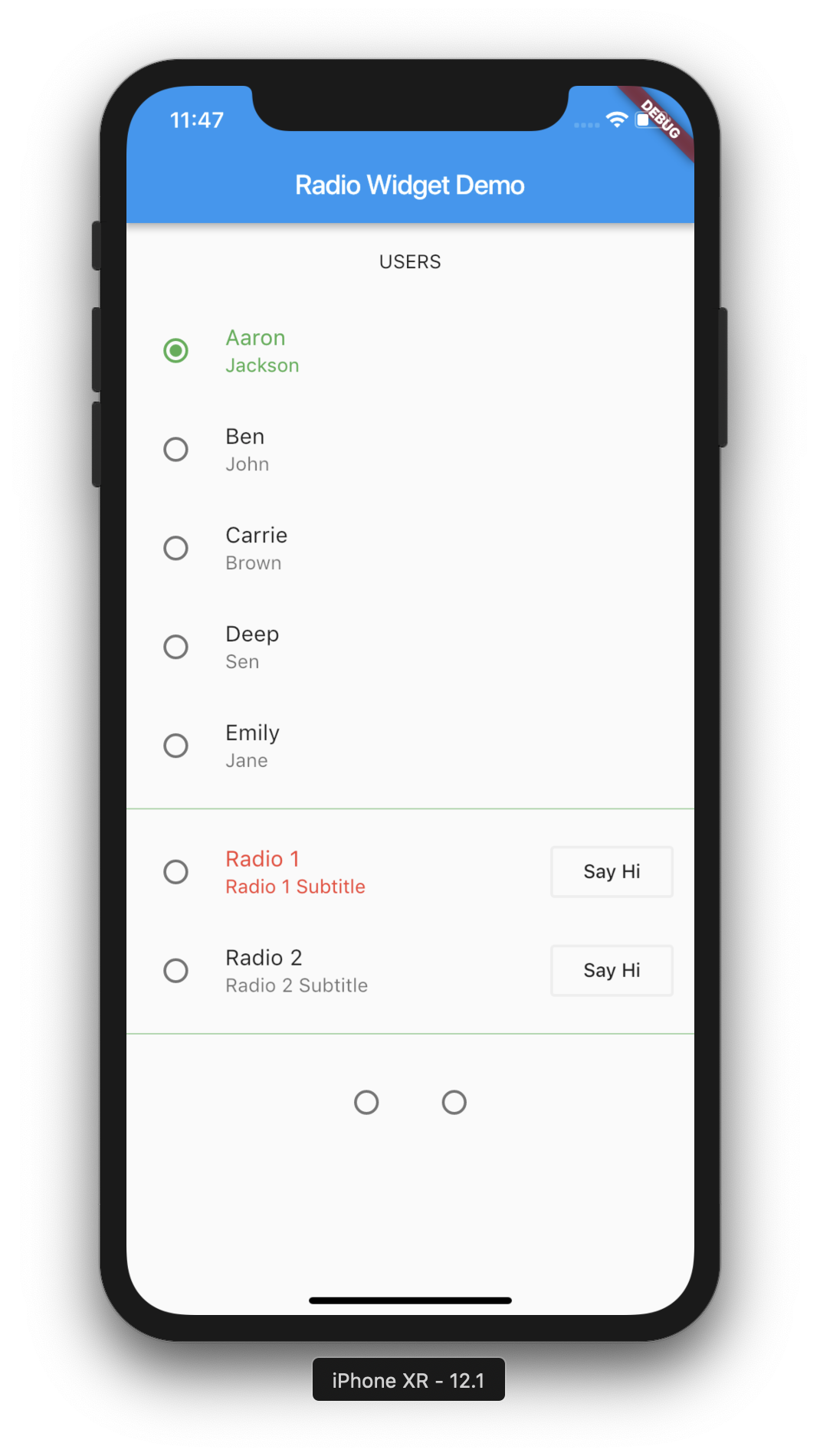
 

Watch Demo


Below is the demo of the app we are going to make.


Watch Video Tutorial


The video tutorial demonstrates all the functions that I am going to describe below.
You can watch the video tutorial to see it in action.


Let’s jump into the code. Start by adding the DataTable widget to your UI.


Add DataTable widget


DataTable(
    columns:[],
    rows:[],
    ...
)

I am writing a method called dataBody() to return the DataTable widget that we add it to the main UI.
we will see it later.


Colums represent the header of the DataTable. Rows should be the same number as columns or empty.


We are going to display a list of users.


Create a new file named “user.dart” and create a class ‘User’. We will have two member variables ‘firstName’ and ‘lastName’.
Also a constructor and a function that returns a list of users.


user.dart


class User {
  String firstName;
  String lastName;

  User({this.firstName, this.lastName});

  static List<User> getUsers() {
    return <User>[
      User(firstName: "Aaryan", lastName: "Shah"),
      User(firstName: "Ben", lastName: "John"),
      User(firstName: "Carrie", lastName: "Brown"),
      User(firstName: "Deep", lastName: "Sen"),
      User(firstName: "Emily", lastName: "Jane"),
    ];
  }
}


Get the users and initialize the State in the main UI.


// Add these to your main UI file.

  List<User> users;
  List<User> selectedUsers;
  bool sort;

  @override
  void initState() {
    sort = false;
    selectedUsers = [];
    users = User.getUsers();
    super.initState();
  }
...


Set the Columns or Headers for Table


 columns: [
          DataColumn(
              label: Text("FIRST NAME"),
              numeric: false,
              tooltip: "This is First Name",
          ),
          DataColumn(
            label: Text("LAST NAME"),
            numeric: false,
            tooltip: "This is Last Name",
          ),
        ],
 ...


Map Users to Rows


 rows: users
        .map(
            (user) => DataRow(
                    selected: selectedUsers.contains(user),
                    onSelectChanged: (b) {
                    print("Onselect");
                    onSelectedRow(b, user);
                    },
                    cells: [
                    DataCell(
                        Text(user.firstName),
                        onTap: () {
                        print('Selected ${user.firstName}');
                        },
                    ),
                    DataCell(
                        Text(user.lastName),
                    ),
                    ]),
        )
        .toList(),
...


Sort the table


We are going to sort the table based on the firstName.
We are going to use the ‘sortAscending’ and ‘sortColumnIndex’ to the DataTable.
Since we know that firstName is the ‘0’th index, we are setting ‘sortColumnIndex’ to zero.


 DataTable(
        sortAscending: sort,
        sortColumnIndex: 0,
 ...


implement the onSort function for each DataColumn.
Declare a bool variable ‘sort’ which we will be toggling when user clicks on the ‘firstName’ header, we will toggle the ‘sort’ variable.
you can see the initialisation above in the initState.


 DataColumn(
        label: Text("FIRST NAME"),
        numeric: false,
        tooltip: "This is First Name",
        onSort: (columnIndex, ascending) {
        setState(() {
            sort = !sort;
        });
        onSortColum(columnIndex, ascending);
        }),
    ),
 ...


Then call the onSortColumn that we are going to write inside the onSort() method.


onSortColum(int columnIndex, bool ascending) {
    if (columnIndex == 0) {
        if (ascending) {
          users.sort((a, b) => a.firstName.compareTo(b.firstName));
        } else {
          users.sort((a, b) => b.firstName.compareTo(a.firstName));
        }
    }
}


‘ascending’ will toggle when we update the ‘sort’ variable using setState() inside the onSort function.


Add the Checkbox


implement ‘onSelectChanged’ method for each row which will be called each time user clicks on the row
and ‘selected’ property to true selects all the checkboxes. Checkboxes will appear for each row when you add this method. But our aim to select the Checkbox for user we select, correct?


We have a variable ‘selectedUsers’ variable declared early which I am initialising in the initState() above.


 onSelectedRow(bool selected, User user) async {
    setState(() {
      if (selected) {
        selectedUsers.add(user);
      } else {
        selectedUsers.remove(user);
      }
    });
  }


If the user clicks the row and if the selected is true, we will add them to ‘selectedUsers’ list.


and update selected to


DataRow(
    selected: selectedUsers.contains(user),
    onSelectChanged: (b) {
        print("Onselect");
        onSelectedRow(b, user);
    },
    ...


When user click on each row, we will check if the added to the list and set the selected property with true or false like below.
‘true’ makes the user Checkbox selected.


selected: selectedUsers.contains(user), makes it true or false which makes the Checkbox corresponding to each user checked or not.


DataRow(
    selected: selectedUsers.contains(user),
    onSelectChanged: (b) {
        print("Onselect");
        onSelectedRow(b, user);
    },
...


Delete Users


I am going to add two buttons just below the DataTable, once shows the number of selected users and the other will call a method to delete Selected SUers.


Let’s write the delete method.


 deleteSelected() async {
    setState(() {
      if (selectedUsers.isNotEmpty) {
        List<User> temp = [];
        temp.addAll(selectedUsers);
        for (User user in temp) {
          users.remove(user);
          selectedUsers.remove(user);
        }
      }
    });
  }


We will add the DataTable inside the ‘SingleChildScrollView’ and add that inside the ‘Expanded’ Widget to prevent the overflow.


Complete Example


import 'package:flutter/material.dart';
import 'user.dart';

class DataTableDemo extends StatefulWidget {
  DataTableDemo() : super();

  final String title = "Data Table Flutter Demo";

  @override
  DataTableDemoState createState() => DataTableDemoState();
}

class DataTableDemoState extends State<DataTableDemo> {
  List<User> users;
  List<User> selectedUsers;
  bool sort;

  @override
  void initState() {
    sort = false;
    selectedUsers = [];
    users = User.getUsers();
    super.initState();
  }

  onSortColum(int columnIndex, bool ascending) {
    if (columnIndex == 0) {
      if (ascending) {
        users.sort((a, b) => a.firstName.compareTo(b.firstName));
      } else {
        users.sort((a, b) => b.firstName.compareTo(a.firstName));
      }
    }
  }

  onSelectedRow(bool selected, User user) async {
    setState(() {
      if (selected) {
        selectedUsers.add(user);
      } else {
        selectedUsers.remove(user);
      }
    });
  }

  deleteSelected() async {
    setState(() {
      if (selectedUsers.isNotEmpty) {
        List<User> temp = [];
        temp.addAll(selectedUsers);
        for (User user in temp) {
          users.remove(user);
          selectedUsers.remove(user);
        }
      }
    });
  }

  SingleChildScrollView dataBody() {
    return SingleChildScrollView(
      scrollDirection: Axis.vertical,
      child: DataTable(
        sortAscending: sort,
        sortColumnIndex: 0,
        columns: [
          DataColumn(
              label: Text("FIRST NAME"),
              numeric: false,
              tooltip: "This is First Name",
              onSort: (columnIndex, ascending) {
                setState(() {
                  sort = !sort;
                });
                onSortColum(columnIndex, ascending);
              }),
          DataColumn(
            label: Text("LAST NAME"),
            numeric: false,
            tooltip: "This is Last Name",
          ),
        ],
        rows: users
            .map(
              (user) => DataRow(
                      selected: selectedUsers.contains(user),
                      onSelectChanged: (b) {
                        print("Onselect");
                        onSelectedRow(b, user);
                      },
                      cells: [
                        DataCell(
                          Text(user.firstName),
                          onTap: () {
                            print('Selected ${user.firstName}');
                          },
                        ),
                        DataCell(
                          Text(user.lastName),
                        ),
                      ]),
            )
            .toList(),
      ),
    );
  }

  @override
  Widget build(BuildContext context) {
    return Scaffold(
      appBar: AppBar(
        title: Text(widget.title),
      ),
      body: Column(
        mainAxisSize: MainAxisSize.min,
        mainAxisAlignment: MainAxisAlignment.center,
        verticalDirection: VerticalDirection.down,
        children: <Widget>[
          Expanded(
            child: dataBody(),
          ),
          Row(
            mainAxisAlignment: MainAxisAlignment.center,
            mainAxisSize: MainAxisSize.min,
            children: <Widget>[
              Padding(
                padding: EdgeInsets.all(20.0),
                child: OutlineButton(
                  child: Text('SELECTED ${selectedUsers.length}'),
                  onPressed: () {},
                ),
              ),
              Padding(
                padding: EdgeInsets.all(20.0),
                child: OutlineButton(
                  child: Text('DELETE SELECTED'),
                  onPressed: selectedUsers.isEmpty
                      ? null
                      : () {
                          deleteSelected();
                        },
                ),
              ),
            ],
          ),
        ],
      ),
    );
  }
}


That’s all about DataTables. Watch the video tutorial to see it in action.

Hope you understood everything about DataTables in Flutter. Please leave your valuable comments below.
I will be happy to clear as per my knowledge.
Thanks for reading.


Rotate, Scale, Skew or Translate Widgets in Flutter using Transform

$
0
0

This articles describes how easily you can rotate, scale or translate widgets in Flutter. We can do that with the
help of Transform Widget.

Watch Demo

Below is the demo of the app that we are going to build.

https://youtu.be/Fw7DJV-QlkI

Watch Video Tutorial

The types of Transform widgets are:

  • Transform (default constructor)
  • Transform.rotate
  • Transform.scale
  • Transform.translate

1. Rotate

Our Screen will have a Slider to change the value of rotate or scale, translate or skew. Then three container widgets that does all the four transformations.
So Let’s start with rotate.

Below function returns a container that implements Rotate Transform.

 Container rotate() {
    return Container(
      child: Transform.rotate(
        angle: sliderVal,
        origin: Offset(0.0, 0.0),
        child: Container(
          height: 50.0,
          width: 50.0,
          color: Colors.red,
        ),
      ),
    );
  }

You can change the offset co change the point at which you want to rotate the widget.

   origin: Offset(100.0, 0.0),

This applies to almost all the ‘Transform’ variations.

Scale

Below function does a scale on the Widget. Change the ‘scale’ value to change the scale for the Widget.

   Container scale() {
    return Container(
      child: Transform.scale(
        scale: sliderVal == 0 ? 1 : sliderVal / 50,
        origin: Offset(0.0, 0.0),
        child: Container(
          height: 100.0,
          width: 100.0,
          color: Colors.green,
        ),
      ),
    );
  }

Translate

  Container translate() {
    return Container(
      child: Transform.translate(
        offset: Offset(200.0, 110.0),
        child: Container(
          height: 100.0,
          width: 100.0,
          color: Colors.yellow,
        ),
      ),
    );
  }

Skew

You can do a skew(), skewX(), or skewY() on the Transform.

  skew() {
    return Container(
      child: Transform(
        transform: Matrix4.skewX(sliderVal / 100),
        child: Container(
          height: 100.0,
          width: 100.0,
          color: Colors.blue,
        ),
      ),
    );
  }

Other Transformations

Below methods does a 3D transformation on a square box.

  threeD() {
    return Container(
      child: Transform(
        transform: Matrix4.identity()
          ..setEntry(3, 2, sliderVal / 1000)
          ..rotateX(3.14 / 20.0),
        alignment: FractionalOffset.center,
        child: Container(
          height: 100.0,
          width: 100.0,
          color: Colors.blue,
        ),
      ),
    );
  }

The default constructor helps you do more transformations. You can freely explore those.
Please leave your valuable comments below

Source Code

Get the source code from by repository

Thanks for reading.

Please leave your valuable comments below this tutorial.
Watch the video tutorial to see the transform widget in action.

Radio, RadioListTile in Flutter – Android & iOS.

$
0
0

This article will explain how to use Radio Buttons in Flutter. You can do this in flutter with the help of ‘Radio’ or ‘RadioListTile’ Widgets.
 

Watch Demo


Watch Video Tutorial


Let’s jump into the code.
 
Add Radio Buttons
 
The Below code adds two radio buttons to the UI.


// Declare this variable
int selectedRadio;

@override
void initState() {
  super.initState();
  selectedRadio = 0;
}

// Changes the selected value on 'onChanged' click on each radio button
setSelectedRadio(int val) {
  setState(() {
    selectedRadio = val;
  });
}

// This goes to the build method 
ButtonBar(
  alignment: MainAxisAlignment.center,
  children: <Widget>[
    Radio(
      value: 1,
      groupValue: selectedRadio,
      activeColor: Colors.green,
      onChanged: (val) {
        print("Radio $val");
        setSelectedRadio(val);
      },
    ),
    Radio(
      value: 2,
      groupValue: selectedRadio,
      activeColor: Colors.blue,
      onChanged: (val) {
        print("Radio $val");
        setSelectedRadio(val);
      },
    ),
  ],
)

 
The ‘value‘ property is the value of each radio button.
The ‘groupValue‘ property is the value that decides whether the radio button in the group should be selected or not.
The ‘activeColor‘ property decides the active color of the radio button.
The ‘onChanged‘ returns the current radio button’s value.
 
The button changes to selected when the ‘value‘ and ‘groupValue‘ becomes equal.
 

Flutter - Radio Widget

Flutter – Radio Widget

Using RadioListTile


// Declare this variable
int selectedRadioTile;

@override
void initState() {
  super.initState();
  selectedRadio = 0;
  selectedRadioTile = 0;
}

setSelectedRadioTile(int val) {
  setState(() {
    selectedRadioTile = val;
  });
}

// This goes to the build method
RadioListTile(
  value: 1,
  groupValue: selectedRadioTile,
  title: Text("Radio 1"),
  subtitle: Text("Radio 1 Subtitle"),
  onChanged: (val) {
    print("Radio Tile pressed $val");
    setSelectedRadioTile(val);
  },
  activeColor: Colors.red,
  secondary: OutlineButton(
    child: Text("Say Hi"),
    onPressed: () {
      print("Say Hello");
    },
  ),
  selected: true,
),
RadioListTile(
  value: 2,
  groupValue: selectedRadioTile,
  title: Text("Radio 2"),
  subtitle: Text("Radio 2 Subtitle"),
  onChanged: (val) {
    print("Radio Tile pressed $val");
    setSelectedRadioTile(val);
  },
  activeColor: Colors.red,
  secondary: OutlineButton(
    child: Text("Say Hi"),
    onPressed: () {
      print("Say Hello");
    },
  ),
  selected: false,
),

 
RadioListTile gives us more control over the normal one. It has additional ‘title‘ and ‘subtitle‘ property and a ‘secondary‘ widget. Here I am setting the ‘secondary‘ widget to an OutlineButton for now.

Flutter - Radio Widget

Flutter – Radio Widget


Radio Group Using Objects
 
Create a new file named ‘user.dart’ and copy these contents.
 
user.dart
class User {
  int userId;
  String firstName;
  String lastName;

  User({this.userId, this.firstName, this.lastName});

  static List<User> getUsers() {
    return <User>[
      User(userId: 1, firstName: "Aaron", lastName: "Jackson"),
      User(userId: 2, firstName: "Ben", lastName: "John"),
      User(userId: 3, firstName: "Carrie", lastName: "Brown"),
      User(userId: 4, firstName: "Deep", lastName: "Sen"),
      User(userId: 5, firstName: "Emily", lastName: "Jane"),
    ];
  }
}

 
Once that is done. Create a List<user> inside you class and initialize in the initState method.
 

List<user> users;

@override
void initState() {
  super.initState();
  users = User.getUsers();
}

setSelectedUser(User user) {
  setState(() {
    selectedUser = user;
  });
}

List<widget> createRadioListUsers() {
  List<widget> widgets = [];
  for (User user in users) {
    widgets.add(
      RadioListTile(
        value: user,
        groupValue: selectedUser,
        title: Text(user.firstName),
        subtitle: Text(user.lastName),
        onChanged: (currentUser) {
          print("Current User ${currentUser.firstName}");
          setSelectedUser(currentUser);
        },
        selected: selectedUser == user,
        activeColor: Colors.green,
      ),
    );
  }
  return widgets;
}

// In the build method
Column(
  children: createRadioListUsers(),
),
....

 
When the user taps each radio button in the list, it will trigger onChanged callback with the currentUser and it will set the global selectedUser object, which will match the corresponding groupValue in the list of widgets and when ‘selectedUser == user‘, that means when each radio button’s user value becomes equal to groupValue, it will become selected. The ‘selected‘ property changes the label color to the ‘activeColor‘, here it is Colors.green.

Flutter - Radio Widget

Flutter – Radio Widget


Source Code
 
Complete Source code is available in below links.
# Main UI Code
# user.dart

Flutter Tutorial – Shared Preferences (Android and iOS)

$
0
0

This article shows how to implement Shared Preferences in Flutter.
 
Watch Video Tutorial


Add Dependency
 
We will be using the shared_preferences plugin from Flutter to implement this.
 
You can go to this link and read more about it.
 
Go to your pubspec.yaml file and add the dependency.
 

 dependencies:
  flutter:
    sdk: flutter

  // your other dependencies..
  shared_preferences: ^0.5.0
  ...

 
Import plugins
 
Import the library to the project file you need. You may need to import the ‘services’ package from flutter because shared preferences uses async operations,
 

import 'package:shared_preferences/shared_preferences.dart';
import 'package:flutter/services.dart';
...

 
Save Data to Preferences
 

Future<bool> saveData() async {
    SharedPreferences preferences = await SharedPreferences.getInstance();
    return await preferences.setString('your_key", "your_data");
}

 
Get the data from Preferences
 

Future<string> loadData() async {
    SharedPreferences preferences = await SharedPreferences.getInstance();
    return preferences.getString("your_key");
}

 
Set the Data to your variable
 
I am declaring a variable ‘data’ and getting the saved data from preferences to the ‘data’ variable with the below function.
 

 setData() {
    loadData().then((value) {
      setState(() {
        data = value;
      });
    });
 }

 
Test Shared Preferences
 
If you want to test preferences by loading some data prior to user saving some data, you can do that with the below code.
 
I am going that in the initState function and calling setData function at the end to show the initial value.
 

@override
  void initState() {
    super.initState();
    const MethodChannel('plugins.flutter.io/shared_preferences')
        .setMockMethodCallHandler(
      (MethodCall methodcall) async {
        if (methodcall.method == 'getAll') {
          return {"flutter." + nameKey: "[ No Name Saved ]"};
        }
        return null;
      },
    );
    setData();
  }
  ...
 

setMockMethodCallHandler is used for testing purposes normally.

 
Complete Example
 
Here I have a TextField, a save button, a Text and another button in the UI. The first button calls ‘saveData’ function to save the data from the TextField to the preferences and second button calls ‘setData’ function which loads te data to our variable and set it to the Text Widget.
 
So here is the complete code
 

import 'package:flutter/material.dart';
import 'package:shared_preferences/shared_preferences.dart';
import 'package:flutter/services.dart';

class SharedPreferenceDemo extends StatefulWidget {
  SharedPreferenceDemo() : super();

  final String title = "Shared Preference Demo";

  @override
  SharedPreferenceDemoState createState() => SharedPreferenceDemoState();
}

class SharedPreferenceDemoState extends State<SharedPreferenceDemo> {
  //
  String data = "";
  String nameKey = "_key_name";
  TextEditingController controller = TextEditingController();

  @override
  void initState() {
    super.initState();
    const MethodChannel('plugins.flutter.io/shared_preferences')
        .setMockMethodCallHandler(
      (MethodCall methodcall) async {
        if (methodcall.method == 'getAll') {
          return {"flutter." + nameKey: "[ No Name Saved ]"};
        }
        return null;
      },
    );
    setData();
  }

  Future<bool> saveData() async {
    SharedPreferences preferences = await SharedPreferences.getInstance();
    return await preferences.setString(nameKey, controller.text);
  }

  Future<String> loadData() async {
    SharedPreferences preferences = await SharedPreferences.getInstance();
    return preferences.getString(nameKey);
  }

  setData() {
    loadData().then((value) {
      setState(() {
        data = value;
      });
    });
  }

  @override
  Widget build(BuildContext context) {
    return Scaffold(
      appBar: AppBar(
        title: Text(widget.title),
      ),
      body: Container(
        alignment: Alignment.center,
        padding: EdgeInsets.all(30.0),
        child: Column(
          mainAxisAlignment: MainAxisAlignment.spaceAround,
          children: <Widget>[
            TextField(
              controller: controller,
              decoration: InputDecoration.collapsed(hintText: "Enter Name"),
            ),
            OutlineButton(
              child: Text("SAVE NAME"),
              onPressed: () {
                saveData();
              },
            ),
            Text(
              data,
              style: TextStyle(fontSize: 20),
            ),
            OutlineButton(
              child: Text("LOAD NAME"),
              onPressed: () {
                setData();
              },
            ),
          ],
        ),
      ),
    );
  }
}

 
That’s it. You can watch the complete youtube tutorial above for better understanding.


Flutter Tutorials – Animated Container – Animate a widget in Flutter

$
0
0

Article shows how to use Animated Containers in Flutter.
AnimatedContainer are used for Implicit animations in Flutter.

Here we will be investigating AnimatedContainer, AnimatedCrossFade and AnimatedOpacity.

 
Watch Video Tutorial


AnimatedContainer
 
This by default uses Linear Interpolation to transition to the new values.
Specify the duration to

var _color = Colors.red;
var _height = 100.0;
var _width = 100.0;
  
  
AnimatedContainer(
    duration: Duration(seconds: 1),
    curve: Curves.bounceIn,
    color: _color,
    height: _height,
    width: _width,
),

....

// Call this method to animate.

animateContainer() {
    setState(() {
        _color = _color == Colors.red ? Colors.green : Colors.red;
        _height = _height == 100 ? 200 : 100;
        _width = _width == 100 ? 200 : 100;
    });
}

AnimatedCrossFade

Here we will animate between two images, which is supplied to the ‘firstChild‘ and ‘secondChild‘ property of the AnimatedCrossFade widget. ‘crossFadeState‘ is another required property where you can use CrossFadeState.showFirst and CrossFadeState.showSecond to toggle between the two widgets.

var _isFirstCrossFadeEnabled = false;

AnimatedCrossFade(
    duration: Duration(milliseconds: 3000),
    firstChild: Container(
        child: Image.asset("images/apple.png"),
        height: 200.0,
        width: 200.0,
    ),
    secondChild: Container(
        child: Image.asset("images/android.png"),
        height: 200.0,
        width: 200.0,
    ),
    crossFadeState: _isFirstCrossFadeEnabled
        ? CrossFadeState.showFirst
        : CrossFadeState.showSecond,
),
....

// Call this method to animate.

animateCrossFade() {
    setState(() {
        _isFirstCrossFadeEnabled = !_isFirstCrossFadeEnabled;
    });
}

AnimatedOpacity

Animate the opacity.

var _opacity = 0.0;

AnimatedOpacity(
    opacity: _opacity,
    duration: Duration(seconds: 2),
    child: FlutterLogo(
        size: 200.0,
    ),
),
....

// Call this method to animate.

animateOpacity() {
    setState(() {
        _opacity = _opacity == 0 ? 1.0 : 0.0;
    });
}

 
That’s it. Watch the video tutorial to see the demo of the app.


Complete Source Code

import 'package:flutter/material.dart';

class AnimatedDemo extends StatefulWidget {
  AnimatedDemo() : super();

  final String title = "Animated Demo";

  @override
  AnimatedDemoState createState() => AnimatedDemoState();
}

class AnimatedDemoState extends State<AnimatedDemo> {
  //
  var _color = Colors.red;
  var _height = 100.0;
  var _width = 100.0;
  var _isFirstCrossFadeEnabled = false;
  var _opacity = 0.0;

  animateContainer() {
    setState(() {
      _color = _color == Colors.red ? Colors.green : Colors.red;
      _height = _height == 100 ? 200 : 100;
      _width = _width == 100 ? 200 : 100;
    });
  }

  animateCrossFade() {
    setState(() {
      _isFirstCrossFadeEnabled = !_isFirstCrossFadeEnabled;
    });
  }

  animateOpacity() {
    setState(() {
      _opacity = _opacity == 0 ? 1.0 : 0.0;
    });
  }

  @override
  Widget build(BuildContext context) {
    return Scaffold(
      appBar: AppBar(
        title: Text(widget.title),
      ),
      body: Container(
        padding: EdgeInsets.all(20.0),
        alignment: Alignment.center,
        child: Column(
          mainAxisAlignment: MainAxisAlignment.start,
          crossAxisAlignment: CrossAxisAlignment.center,
          children: <Widget>[
            AnimatedContainer(
              duration: Duration(seconds: 1),
              curve: Curves.bounceIn,
              color: _color,
              height: _height,
              width: _width,
            ),
            OutlineButton(
              child: Text("Animate Container"),
              onPressed: () {
                animateContainer();
              },
            ),
            AnimatedCrossFade(
              duration: Duration(milliseconds: 3000),
              firstChild: Container(
                child: Image.asset("images/apple.png"),
                height: 200.0,
                width: 200.0,
              ),
              secondChild: Container(
                child: Image.asset("images/android.png"),
                height: 200.0,
                width: 200.0,
              ),
              crossFadeState: _isFirstCrossFadeEnabled
                  ? CrossFadeState.showFirst
                  : CrossFadeState.showSecond,
            ),
            OutlineButton(
              child: Text("Animate CrossFade"),
              onPressed: () {
                animateCrossFade();
              },
            ),
            AnimatedOpacity(
              opacity: _opacity,
              duration: Duration(seconds: 2),
              child: FlutterLogo(
                size: 200.0,
              ),
            ),
            OutlineButton(
              child: Text("Animate Opacity"),
              onPressed: () {
                animateOpacity();
              },
            ),
          ],
        ),
      ),
    );
  }
}

Flutter Tutorials – Custom Progressbar using CustomPaint

$
0
0

Welcome to yet another Flutter Tutorial, in this Tutorial we will see how to create a custom Progressbar using Custom Paint.

 
Watch Video Tutorial


Custom Painter class
 
Create a new file named progress_painter.dart and create a class named ‘ProgressPainter’. This class extends the CustomPaint class and overrides two methods which needs to implemented.
 
The two methods are

  @override
  void paint(Canvas canvas, Size size) {
    ...
  }

  @override
  bool shouldRepaint(CustomPainter painter) {
    return true;
  }

 
This class takes four parameters – default circle color, progress circle color, completed percentage and the Width of the circle.
 

  Color defaultCircleColor;
  Color percentageCompletedCircleColor;
  double completedPercentage;
  double circleWidth;

  ProgressPainter(
      {this.defaultCircleColor,
      this.percentageCompletedCircleColor,
      this.completedPercentage,
      this.circleWidth});

      ...

 
Draw Circles
 
Now draw two circles, one for background and other for progress.
 

 getPaint(Color color) {
    return Paint()
      ..color = color
      ..strokeCap = StrokeCap.round
      ..style = PaintingStyle.stroke
      ..strokeWidth = circleWidth;
  }

  @override
  void paint(Canvas canvas, Size size) {
    Paint defaultCirclePaint = getPaint(defaultCircleColor);
    Paint progressCirclePaint = getPaint(percentageCompletedCircleColor);

    Offset center = Offset(size.width / 2, size.height / 2);
    double radius = min(size.width / 2, size.height / 2);
    canvas.drawCircle(center, radius, defaultCirclePaint);

    double arcAngle = 2 * pi * (completedPercentage / 100);
    canvas.drawArc(Rect.fromCircle(center: center, radius: radius), -pi / 2,
        arcAngle, false, progressCirclePaint);
  }

 
The Size of the Custom Paint object is the size of it’s child. Then we give a start angle, which is -pi/2radians, keep in mind its not 0. The top is -pi/2, 0 is the right-most point of the circle. We supply in the arcAngle then, which is how much the arc should extend too. We pass in false after that to tell that we don’t want the end of the arc to be connected back to the centre and at last we send in the Paintobject, complete
That’s all you need for drawing two circles on top of another.
 
ProgressPainter complete code
 

import 'package:flutter/material.dart';
import 'dart:math';

class ProgressPainter extends CustomPainter {
  //
  Color defaultCircleColor;
  Color percentageCompletedCircleColor;
  double completedPercentage;
  double circleWidth;

  ProgressPainter(
      {this.defaultCircleColor,
      this.percentageCompletedCircleColor,
      this.completedPercentage,
      this.circleWidth});

  getPaint(Color color) {
    return Paint()
      ..color = color
      ..strokeCap = StrokeCap.round
      ..style = PaintingStyle.stroke
      ..strokeWidth = circleWidth;
  }

  @override
  void paint(Canvas canvas, Size size) {
    Paint defaultCirclePaint = getPaint(defaultCircleColor);
    Paint progressCirclePaint = getPaint(percentageCompletedCircleColor);

    Offset center = Offset(size.width / 2, size.height / 2);
    double radius = min(size.width / 2, size.height / 2);
    canvas.drawCircle(center, radius, defaultCirclePaint);

    double arcAngle = 2 * pi * (completedPercentage / 100);
    canvas.drawArc(Rect.fromCircle(center: center, radius: radius), -pi / 2,
        arcAngle, false, progressCirclePaint);
  }

  @override
  bool shouldRepaint(CustomPainter painter) {
    return true;
  }
}

 
Implementation
 
Now let’s implement our custom painter.
 
Add the Progress View
 

I have the image ‘checkmark.png’ in a folder named “images” folder in my project and don’t forget to add to ‘pubspec.yaml’ file.


getDoneImage() {
  return Image.asset(
    "images/checkmark.png",
    width: 50,
    height: 50,
  );
}

getProgressText() {
    return Text(
      _nextPercentage == 0 ? '' : '${_nextPercentage.toInt()}',
      style: TextStyle(
          fontSize: 40, fontWeight: FontWeight.w800, color: Colors.green),
    );
  }

  progressView() {
    return CustomPaint(
      child: Center(
        child: _progressDone ? getDoneImage() : getProgressText(),
      ),
      foregroundPainter: ProgressPainter(
          defaultCircleColor: Colors.amber,
          percentageCompletedCircleColor: Colors.green,
          completedPercentage: _percentage,
          circleWidth: 50.0),
    );
  }

 
The above method returns a Custompaint object which has a ‘Text’ as a child.
 
We have the below variables declared
 

 double _percentage;
 double _nextPercentage;
 Timer _timer;
 AnimationController _progressAnimationController;
 bool _progressDone;

Initialize the variables

 @override
  initState() {
    super.initState();
    _percentage = 0.0;
    _nextPercentage = 0.0;
    _timer = null;
    _progressDone = false;
    initAnimationController();
  }

  initAnimationController() {
    _progressAnimationController = AnimationController(
      vsync: this,
      duration: Duration(milliseconds: 1000),
    )..addListener(
        () {
          setState(() {
            _percentage = lerpDouble(_percentage, _nextPercentage,
                _progressAnimationController.value);
          });
        },
      );
  }
  ...

 
Update the Progress
 

 publishProgress() {
    setState(() {
      _percentage = _nextPercentage;
      _nextPercentage += 0.5;
      if (_nextPercentage > 100.0) {
        _percentage = 0.0;
        _nextPercentage = 0.0;
      }
      _progressAnimationController.forward(from: 0.0);
    });
  }

 
Updating ProgressView with Timer
 

 start() {
    Timer.periodic(Duration(milliseconds: 30), handleTicker);
  }

  handleTicker(Timer timer) {
    _timer = timer;
    if (_nextPercentage < 100) {
      publishProgress();
    } else {
      timer.cancel();
      setState(() {
        _progressDone = true;
      });
    }
  }

  startProgress() {
    if (null != _timer && _timer.isActive) {
      _timer.cancel();
    }
    setState(() {
      _percentage = 0.0;
      _nextPercentage = 0.0;
      _progressDone = false;
      start();
    });
  }

 
We have initalized the time in the above code and starts when we call ‘start’ function
and periodically calls ‘handleTicker’ function and updates the progressbar until _nextPercentage reaches 100.
Then we cancel the timer using timer.cancel().
 
Complete UI Code
 

import 'package:flutter/material.dart';
import 'progress_painter.dart';
import 'dart:ui';
import 'dart:async';

class CustomDemo extends StatefulWidget {
  CustomDemo() : super();

  final String title = "Custom Paint Demo";

  @override
  CustomDemoState createState() => CustomDemoState();
}

class CustomDemoState extends State<CustomDemo>
    with SingleTickerProviderStateMixin {
  //
  double _percentage;
  double _nextPercentage;
  Timer _timer;
  AnimationController _progressAnimationController;
  bool _progressDone;

  @override
  initState() {
    super.initState();
    _percentage = 0.0;
    _nextPercentage = 0.0;
    _timer = null;
    _progressDone = false;
    initAnimationController();
  }

  initAnimationController() {
    _progressAnimationController = AnimationController(
      vsync: this,
      duration: Duration(milliseconds: 1000),
    )..addListener(
        () {
          setState(() {
            _percentage = lerpDouble(_percentage, _nextPercentage,
                _progressAnimationController.value);
          });
        },
      );
  }

  start() {
    Timer.periodic(Duration(milliseconds: 30), handleTicker);
  }

  handleTicker(Timer timer) {
    _timer = timer;
    if (_nextPercentage < 100) {
      publishProgress();
    } else {
      timer.cancel();
      setState(() {
        _progressDone = true;
      });
    }
  }

  startProgress() {
    if (null != _timer && _timer.isActive) {
      _timer.cancel();
    }
    setState(() {
      _percentage = 0.0;
      _nextPercentage = 0.0;
      _progressDone = false;
      start();
    });
  }

  publishProgress() {
    setState(() {
      _percentage = _nextPercentage;
      _nextPercentage += 0.5;
      if (_nextPercentage > 100.0) {
        _percentage = 0.0;
        _nextPercentage = 0.0;
      }
      _progressAnimationController.forward(from: 0.0);
    });
  }

  getDoneImage() {
    return Image.asset(
      "images/checkmark.png",
      width: 50,
      height: 50,
    );
  }

  getProgressText() {
    return Text(
      _nextPercentage == 0 ? '' : '${_nextPercentage.toInt()}',
      style: TextStyle(
          fontSize: 40, fontWeight: FontWeight.w800, color: Colors.green),
    );
  }

  progressView() {
    return CustomPaint(
      child: Center(
        child: _progressDone ? getDoneImage() : getProgressText(),
      ),
      foregroundPainter: ProgressPainter(
          defaultCircleColor: Colors.amber,
          percentageCompletedCircleColor: Colors.green,
          completedPercentage: _percentage,
          circleWidth: 50.0),
    );
  }

  @override
  Widget build(BuildContext context) {
    return Scaffold(
      appBar: AppBar(
        title: Text(widget.title),
      ),
      body: Container(
        alignment: Alignment.center,
        child: Column(
          mainAxisAlignment: MainAxisAlignment.center,
          crossAxisAlignment: CrossAxisAlignment.center,
          children: <Widget>[
            Container(
              height: 200.0,
              width: 200.0,
              padding: EdgeInsets.all(20.0),
              margin: EdgeInsets.all(30.0),
              child: progressView(),
            ),
            OutlineButton(
              child: Text("START"),
              onPressed: () {
                startProgress();
              },
            )
          ],
        ),
      ),
    );
  }
}

 
That’s it.
 

Flutter Tutorials – Image Blur Effect using ImageFilters and BackdropFilters.

$
0
0

Hello,
 

Flutter Image Filter

Flutter Image Filter


Flutter makes it easy to apply filters to images. This article shows one of the ways to do that. The BackdropFilter widget along with ImageFilter class helps us to achieve this effect.
 
Watch Video Tutorial


Let’s Start…
 
Complete Code
 
I will be showing the complete source code here and explain after that.
Below is the complete code.
import 'package:flutter/material.dart';
import 'dart:ui';

class BackDropFilterDemo extends StatefulWidget {
  BackDropFilterDemo() : super();

  final String title = "Image Filter Demo";

  @override
  BackDropFilterDemoState createState() => BackDropFilterDemoState();
}

class BackDropFilterDemoState extends State<BackDropFilterDemo> {
  @override
  Widget build(BuildContext context) {
    return Scaffold(
      appBar: AppBar(
        title: Text(widget.title),
      ),
      body: Container(
        color: Colors.white,
        child: Center(
          child: Stack(
            children: <Widget>[
              Image.asset(
                "images/parrot.jpg",
                width: 400,
                height: 300,
                fit: BoxFit.fill,
              ),
              Positioned(
                top: 10,
                bottom: 150,
                left: 30,
                right: 100,
                child: BackdropFilter(
                  filter: ImageFilter.blur(sigmaX: 5, sigmaY: 5),
                  child: Container(
                    color: Colors.black.withOpacity(0),
                  ),
                ),
              )
            ],
          ),
        ),
      ),
    );
  }
}

 
This is the simple code to achieve a simple blur effect in a part of the image.
 
The Backdropfilter helps you to achieve the blur effect along with ImageFilter. The main thing to remember is that, the blur will be applied not to the child of BackDropFilter, but to the widget, beneath it. Here it is the ‘Parrot’ image. The Positioned.fill widget is used to fill the blur in the entire image. You can blur certain portions of the image with the help of Positioned(top:xx, bottom:xx, left: xx, right:xx). You can have your own effect with the help of ImageFilter.matrix() function. For example, rotate or skew the image.
 
This can also be applied even if the image is downloaded from the internet.
 
That’s it. Flutter makes it easy for you.
Happy Coding.
 
Leave your valuable comments below.
 
Thanks for reading.


Flutter Tutorial – Complete GridView Tutorial

$
0
0

Below are the things that we are going to do.
 
1. Fetch data from Webservice
2. Create List of Objects from Webservice
3. Create View for each for in GridView
4. Call Webservice function in Main File with FutureBuilder.
5. Show Progress until data downloads
6. Show Error when some error happens.
7. Add Tap to the GridView Cell.
8. Pass Data to next screen from Row Click
9. Show record count in the HomeScreen TitleBar.

Watch Video Tutorial


So Let’s start one by one.
 
Below is the free json Webservice that we are going to use.
 
https://jsonplaceholder.typicode.com/photos
You can see around 5000 records in the below format.

 {
    "albumId": 1,
    "id": 1,
    "title": "accusamus beatae ad facilis cum similique qui sunt",
    "url": "https://via.placeholder.com/600/92c952",
    "thumbnailUrl": "https://via.placeholder.com/150/92c952"
 },
...

 
Create the Model
 
We are going to create a model class for the above record now.
Create a new file named ‘album.dart’ and then create new class with the member variables as above.
 

class Album {
  int albumId;
  int id;
  String title;
  String url;
  String thumbnailUrl;

  Album({this.albumId, this.id, this.title, this.url, this.thumbnailUrl});

  // Return object from JSON //
  factory Album.fromJson(Map<String, dynamic> json) {
    return Album(
        albumId: json['albumId'] as int,
        id: json['id'] as int,
        title: json['title'] as String,
        url: json['url'] as String,
        thumbnailUrl: json['thumbnailUrl'] as String);
  }
}

 
The ‘fromJson‘ function creates an Album object from the json object provided to it. We will be using it in the next section during the service call.
 
Service Call
 
Add the below library under the dependencies in the ‘pubspec.yaml’ file which is present in your root folder.
 

import 'dart:convert';
import 'package:http/http.dart' as http;
import 'album.dart';

class Services {
  static Future<List<Album>> getPhotos() async {
    try {
      final response =
          await http.get("https://jsonplaceholder.typicode.com/photos");
      if (response.statusCode == 200) {
        List<Album> list = parsePhotos(response.body);
        return list;
      } else {
        throw Exception("Error");
      }
    } catch (e) {
      throw Exception(e.toString());
    }
  }

  // Parse the JSON response and return list of Album Objects //
  static List<Album> parsePhotos(String responseBody) {
    final parsed = json.decode(responseBody).cast<Map<String, dynamic>>();
    return parsed.map<Album>((json) => Album.fromJson(json)).toList();
  }
}

Cell View for each row in the GridView
 
Our Cell will have a rounded Card Widget, with containers aligned to center. Also It will have one image and a Text below it.
 
This is how the code looks like. I have added some decorations to it, like rounded corners etc which is readable from the code itself.
 

import 'package:flutter/material.dart';
import 'album.dart';

class AlbumCell extends StatelessWidget {
  const AlbumCell(this.context, this.album);
  @required
  final Album album;
  final BuildContext context;

  @override
  Widget build(BuildContext context) {
    return Card(
      color: Colors.white,
      child: Padding(
        padding:
            EdgeInsets.only(left: 10.0, right: 10.0, bottom: 10.0, top: 10.0),
        child: Container(
          alignment: Alignment.center,
          child: Column(
            crossAxisAlignment: CrossAxisAlignment.start,
            children: <Widget>[
              Flexible(
                child: Image.network(
                  album.thumbnailUrl,
                  width: 150,
                  height: 150,
                ),
              ),
              Padding(
                padding: EdgeInsets.all(10.0),
                child: Text(
                  album.title,
                  maxLines: 1,
                  softWrap: true,
                  textAlign: TextAlign.center,
                ),
              ),
            ],
          ),
        ),
      ),
    );
  }
}

 
Home Screen or Main UI with GridView
 
This is the screen that has the GridView. Our requirements for getting data from the service, model classes and parsing is now done.
Now let’s map it to the GridView.

My build function’s body will look like this

  body: Column(
        mainAxisAlignment: MainAxisAlignment.start,
        crossAxisAlignment: CrossAxisAlignment.start,
        mainAxisSize: MainAxisSize.min,
        children: <Widget>[
          Flexible(
            child: FutureBuilder<List<Album>>(
              future: Services.getPhotos(),
              builder: (context, snapshot) {
                // not setstate here
                //
                if (snapshot.hasError) {
                  return Text('Error ${snapshot.error}');
                }
                //
                if (snapshot.hasData) {
                  streamController.sink.add(snapshot.data.length);
                  // gridview
                  return gridview(snapshot);
                }

                return circularProgress();
              },
            ),
          ),
        ],
      ),
...

gridview(AsyncSnapshot<List<Album>> snapshot) {
    return Padding(
      padding: EdgeInsets.all(5.0),
      child: GridView.count(
        crossAxisCount: 2,
        childAspectRatio: 1.0,
        mainAxisSpacing: 4.0,
        crossAxisSpacing: 4.0,
        children: snapshot.data.map(
          (album) {
              child: GridTile(
                child: AlbumCell(album),
              );
          },
        ).toList(),
      ),
    );
  }

   circularProgress() {
    return Center(
      child: const CircularProgressIndicator(),
    );
  }

 
Make sure you import the classes we created above.
Then Services.getPhotos() will get the list of Album Objects. If there is some error, we will show a Text With Error. Show a CircularProgress until the UI is waiting for the data.
If everything is OK, then we will show our gridview by calling the gridview(snapshot). The snapshot will have the list of album records.
 
Add Click to GridView Cell
 
Wrapping the ‘GridTile‘ in each row with GestureDetector, then you can have onTap function for each cell in the GridView.

Code will change a little bit like this…

 return GestureDetector(
        child: GridTile(
        child: AlbumCell(album),
        ),
        onTap: () {
            goToDetailsPage(context, album);
        },
    );
...

 
Navigate to Next Screen on Row Click
 
Create a new file named ‘details.dart’ for the new Screen and copy the below contents to it.

import 'package:flutter/material.dart';
import 'album.dart';

class GridDetails extends StatefulWidget {
  final Album curAlbum;
  GridDetails({@required this.curAlbum});

  @override
  GridDetailsState createState() => GridDetailsState();
}

class GridDetailsState extends State<GridDetails> {
  //
  @override
  Widget build(BuildContext context) {
    return Scaffold(
      body: Container(
        alignment: Alignment.center,
        margin: EdgeInsets.all(30.0),
        child: Column(
          crossAxisAlignment: CrossAxisAlignment.center,
          mainAxisAlignment: MainAxisAlignment.center,
          children: <Widget>[
            FadeInImage.assetNetwork(
                placeholder: "images/no_image.png",
                image: widget.curAlbum.url,
            ),
            SizedBox(
              height: 30.0,
            ),
            OutlineButton(
              child: Icon(Icons.close),
              onPressed: () => Navigator.of(context).pop(),
            ),
          ],
        ),
      ),
    );
  }
}

 
Write the function to navigate To the DetailsScreen.
Make sure to import the details screen. The DetailsScreen will accept only one parameter, the ‘album’ object.
 

  goToDetailsPage(BuildContext context, Album album) {
    Navigator.push(
      context,
      MaterialPageRoute(
        fullscreenDialog: true,
        builder: (BuildContext context) => GridDetails(
              curAlbum: album,
            ),
      ),
    );
  }

 
Update the Title with Record Count
 
You have to remember one thing here, you cannot call setState inside the FutureBuilder like below…
 

 Flexible(
    child: FutureBuilder<List<Album>>(
        future: Services.getPhotos(),
        builder: (context, snapshot) {
        // not setstate here
        //
        ...

 
One alternate is ‘streamController’.
 

import 'dart:async';

....

 StreamController<int> streamController = new StreamController<int>();
 ...

 // Title changes
appBar: AppBar(
        title: StreamBuilder(
        initialData: 0,
        stream: streamController.stream,
        builder: (BuildContext context, AsyncSnapshot snapshot) {
            return Text('${widget.title} ${snapshot.data}');
        },
    ),
),
...

 
Complete Main File Code
 

import 'package:flutter/material.dart';
import 'services.dart';
import 'album.dart';
import 'gridcell.dart';
import 'details.dart';
import 'dart:async';

class GridViewDemo extends StatefulWidget {
  GridViewDemo() : super();

  final String title = "Photos";

  @override
  GridViewDemoState createState() => GridViewDemoState();
}

class GridViewDemoState extends State<GridViewDemo> {
  //
  StreamController<int> streamController = new StreamController<int>();

  gridview(AsyncSnapshot<List<Album>> snapshot) {
    return Padding(
      padding: EdgeInsets.all(5.0),
      child: GridView.count(
        crossAxisCount: 2,
        childAspectRatio: 1.0,
        mainAxisSpacing: 4.0,
        crossAxisSpacing: 4.0,
        children: snapshot.data.map(
          (album) {
            return GestureDetector(
              child: GridTile(
                child: AlbumCell(album),
              ),
              onTap: () {
                goToDetailsPage(context, album);
              },
            );
          },
        ).toList(),
      ),
    );
  }

  goToDetailsPage(BuildContext context, Album album) {
    Navigator.push(
      context,
      MaterialPageRoute(
        fullscreenDialog: true,
        builder: (BuildContext context) => GridDetails(
              curAlbum: album,
            ),
      ),
    );
  }

  circularProgress() {
    return Center(
      child: const CircularProgressIndicator(),
    );
  }

  @override
  Widget build(BuildContext context) {
    return Scaffold(
      appBar: AppBar(
          title: StreamBuilder(
        initialData: 0,
        stream: streamController.stream,
        builder: (BuildContext context, AsyncSnapshot snapshot) {
          return Text('${widget.title} ${snapshot.data}');
        },
      )),
      body: Column(
        mainAxisAlignment: MainAxisAlignment.start,
        crossAxisAlignment: CrossAxisAlignment.start,
        mainAxisSize: MainAxisSize.min,
        children: <Widget>[
          Flexible(
            child: FutureBuilder<List<Album>>(
              future: Services.getPhotos(),
              builder: (context, snapshot) {
                // not setstate here
                //
                if (snapshot.hasError) {
                  return Text('Error ${snapshot.error}');
                }
                //
                if (snapshot.hasData) {
                  streamController.sink.add(snapshot.data.length);
                  // gridview
                  return gridview(snapshot);
                }

                return circularProgress();
              },
            ),
          ),
        ],
      ),
    );
  }

  @override
  void dispose() {
    streamController.close();
    super.dispose();
  }
}

Complete Source Code

Get the complete source code from the below link…
https://bitbucket.org/vipinvijayan1987/tutorialprojects/src/master/FlutterTutorialProjects/flutter_demo1/lib/widgets/gridview/

 
Thanks for reading.
Please leave your valuable comments below.

Flutter Tutorials – CloudFireStore CRUD Operations in Flutter

$
0
0

For accessing CloudFireStore for Firebase, you need to have Firebase account.
For that you need to go to https://console.firebase.google.com and sign up.
 
Watch Video Tutorial


# Create a project and give the details
# Once you create the project, Click Add new App in the Project Settings.
 

Create new App - Firebase

Create new App – Firebase


# Add the Details for your app.
  # For Android – Package name can be found in the app-level build.gradle.
  # for iOS – Go to General tab for each target in Xcode.
Get the AppID and Register

Get the AppID and Register

Both should be same in the case of Flutter.
 
Once you get the google-services.json & Google-Services-Info.plist for Android and iOS Respectively
For Android copy it into the debug and release folders inside each flavor.
For iOS copy it to the root of the project or corresponding target folders.

 
# Make sure you have added the configurations need for Android in build.gradle files as per this ink.
 
https://firebase.google.com/docs/android/setup#add_the_sdk
 
Once your project and app has created in the Firebase console, we can start working with Flutter code.
 
Add the package for Flutter

Go to the pubspec.yaml file in the root of your Flutter project and the Flutter package below the dependencies.

 dependencies:
  flutter:
    sdk: flutter

  ...
  cloud_firestore: ^0.9.0+1

Flutter should download the packages for you or run ‘flutter packages get’.

In Firestore, data is stored as collection of documents.

So Lets start the CRUD operations in CloudFireStore.

Get the documents

  getUsers() {
    return Firestore.instance.collection(collectionName).snapshots();
  }

Show Users in a List

Widget buildBody(BuildContext context) {
    return StreamBuilder<QuerySnapshot>(
      stream: getUsers(),
      builder: (context, snapshot) {
        if (snapshot.hasError) {
          return Text('Error ${snapshot.error}');
        }
        if (snapshot.hasData) {
          print("Documents ${snapshot.data.documents.length}");
          return buildList(context, snapshot.data.documents);
        }
        return CircularProgressIndicator();
      },
    );
  }

  Widget buildList(BuildContext context, List<DocumentSnapshot> snapshot) {
    return ListView(
      children: snapshot.map((data) => buildListItem(context, data)).toList(),
    );
  }

  Widget buildListItem(BuildContext context, DocumentSnapshot data) {
    final user = User.fromSnapshot(data);
    return Padding(
      key: ValueKey(user.name),
      padding: EdgeInsets.symmetric(vertical: 8.0),
      child: Container(
        decoration: BoxDecoration(
          border: Border.all(color: Colors.grey),
          borderRadius: BorderRadius.circular(5.0),
        ),
        child: ListTile(
          title: Text(user.name),
          trailing: IconButton(
            icon: Icon(Icons.delete),
            onPressed: () {
              // delete
              delete(user);
            },
          ),
          onTap: () {
            // update
            setUpdateUI(user);
          },
        ),
      ),
    );
  }

Add the Document

  addUser() {
    User user = User(name: controller.text);
    try {
      Firestore.instance.runTransaction(
        (Transaction transaction) async {
          await Firestore.instance
              .collection(collectionName)
              .document()
              .setData(user.toJson());
        },
      );
    } catch (e) {
      print(e.toString());
    }
  }
 

Update Document

   update(User user, String newName) {
    try {
      Firestore.instance.runTransaction((transaction) async {
        await transaction.update(user.reference, {'name': newName});
      });
    } catch (e) {
      print(e.toString());
    }
  }

Delete User

 delete(User user) {
    Firestore.instance.runTransaction(
      (Transaction transaction) async {
        await transaction.delete(user.reference);
      },
    );
  }

Complete Source Code
 

import 'package:flutter/material.dart';
import 'package:cloud_firestore/cloud_firestore.dart';
import 'user.dart';

class FireBaseFireStoreDemo extends StatefulWidget {
  FireBaseFireStoreDemo() : super();

  final String title = "CloudFireStore Demo";
  @override
  FireBaseFireStoreDemoState createState() => FireBaseFireStoreDemoState();
}

class FireBaseFireStoreDemoState extends State<FireBaseFireStoreDemo> {
  //
  bool showTextField = false;
  TextEditingController controller = TextEditingController();
  String collectionName = "Users";
  bool isEditing = false;
  User curUser;

  getUsers() {
    return Firestore.instance.collection(collectionName).snapshots();
  }

  addUser() {
    User user = User(name: controller.text);
    try {
      Firestore.instance.runTransaction(
        (Transaction transaction) async {
          await Firestore.instance
              .collection(collectionName)
              .document()
              .setData(user.toJson());
        },
      );
    } catch (e) {
      print(e.toString());
    }
  }

  add() {
    if (isEditing) {
      // Update
      update(curUser, controller.text);
      setState(() {
        isEditing = false;
      });
    } else {
      addUser();
    }
    controller.text = '';
  }

  update(User user, String newName) {
    try {
      Firestore.instance.runTransaction((transaction) async {
        await transaction.update(user.reference, {'name': newName});
      });
    } catch (e) {
      print(e.toString());
    }
  }

  delete(User user) {
    Firestore.instance.runTransaction(
      (Transaction transaction) async {
        await transaction.delete(user.reference);
      },
    );
  }

  Widget buildBody(BuildContext context) {
    return StreamBuilder<QuerySnapshot>(
      stream: getUsers(),
      builder: (context, snapshot) {
        if (snapshot.hasError) {
          return Text('Error ${snapshot.error}');
        }
        if (snapshot.hasData) {
          print("Documents ${snapshot.data.documents.length}");
          return buildList(context, snapshot.data.documents);
        }
        return CircularProgressIndicator();
      },
    );
  }

  Widget buildList(BuildContext context, List<DocumentSnapshot> snapshot) {
    return ListView(
      children: snapshot.map((data) => buildListItem(context, data)).toList(),
    );
  }

  Widget buildListItem(BuildContext context, DocumentSnapshot data) {
    final user = User.fromSnapshot(data);
    return Padding(
      key: ValueKey(user.name),
      padding: EdgeInsets.symmetric(vertical: 8.0),
      child: Container(
        decoration: BoxDecoration(
          border: Border.all(color: Colors.grey),
          borderRadius: BorderRadius.circular(5.0),
        ),
        child: ListTile(
          title: Text(user.name),
          trailing: IconButton(
            icon: Icon(Icons.delete),
            onPressed: () {
              // delete
              delete(user);
            },
          ),
          onTap: () {
            // update
            setUpdateUI(user);
          },
        ),
      ),
    );
  }

  setUpdateUI(User user) {
    controller.text = user.name;
    setState(() {
      showTextField = true;
      isEditing = true;
      curUser = user;
    });
  }

  button() {
    return SizedBox(
      width: double.infinity,
      child: OutlineButton(
        child: Text(isEditing ? "UPDATE" : "ADD"),
        onPressed: () {
          add();
          setState(() {
            showTextField = false;
          });
        },
      ),
    );
  }

  @override
  Widget build(BuildContext context) {
    return Scaffold(
      appBar: AppBar(
        title: Text(widget.title),
        actions: <Widget>[
          IconButton(
            icon: Icon(Icons.add),
            onPressed: () {
              setState(() {
                showTextField = !showTextField;
              });
            },
          ),
        ],
      ),
      body: Container(
        padding: EdgeInsets.all(20.0),
        child: Column(
          crossAxisAlignment: CrossAxisAlignment.center,
          mainAxisAlignment: MainAxisAlignment.start,
          children: <Widget>[
            showTextField
                ? Column(
                    crossAxisAlignment: CrossAxisAlignment.center,
                    mainAxisAlignment: MainAxisAlignment.start,
                    children: <Widget>[
                      TextFormField(
                        controller: controller,
                        decoration: InputDecoration(
                            labelText: "Name", hintText: "Enter name"),
                      ),
                      SizedBox(
                        height: 10,
                      ),
                      button(),
                    ],
                  )
                : Container(),
            SizedBox(
              height: 20,
            ),
            Text(
              "USERS",
              style: TextStyle(fontSize: 20, fontWeight: FontWeight.w900),
            ),
            SizedBox(
              height: 20,
            ),
            Flexible(
              child: buildBody(context),
            ),
          ],
        ),
      ),
    );
  }
}

 
Source Code
 
You can get the complete source code from here.
 

Complex JSON Parsing in Flutter / Dart

$
0
0

Hi

This article helps you to do complex Json Parsing in Flutter or dart.

Watch Video Tutorial

Simple JSON

I have the following json in a file named “person.json” in a folder named “json” in root of my project.

{
  "id": "1001",
  "name": "Vipin",
  "age": 25
}

To parse this json, we will create a model class named “Person”.

class Person {
  final String id;
  final String name;
  final int age;

  Person(
      {this.id, this.name, this.age, this.places, this.images, this.address});

  factory Person.fromJson(Map<String, dynamic> json) {
    return Person(
      id: json['id'],
      name: json['name'],
      age: json['age']
    );
  }
}

The “fromJson” method creates a “Person” object and parses the incoming Json object.

Load the JSON file from assets

Future<String> loadPersonFromAssets() async {
        return await rootBundle.loadString('json/person.json');
}

Load the Person

Future loadPerson() async {
    String jsonString = await loadPersonFromAssets();
    final jsonResponse = json.decode(jsonString);
    Person person = new Person.fromJson(jsonResponse);
    print('Name: ${person.name}');
}

Parsing List of Strings

Let’s add some more data to the json file.

"places": [
    "India",
    "US"
  ],

Now we have a list of json strings.

Add the below line to Person class

final List<String> places;

Update the constructor

  Person(
      {this.id, this.name, this.age, this.places, this.images, this.address});

  factory Person.fromJson(Map<String, dynamic> json) {
    return Person(
      id: json['id'],
      name: json['name'],
      age: json['age'],
      places: parsePlaces(json['places']), 
    );
  }

  static List<String> parsePlaces(placesJson) {
    List<String> placesList = new List<String>.from(placesJson);
    return placesList;
  }

The ‘parsePlaces’ will parse the json with places and returns the List of Strings.

Another simple way is just specify

final List places; // in this case it will be List<dynamic>

and the fromJson method will change to just

 places: json['places']);

Parse List of Objects

Now we will add a list of objects to our json.

...
 "images": [
    {
      "id": 10,
      "name": "img1"
    },
    {
      "id": 11,
      "name": "img2"
    }
  ],

Now let’s create the class for Images

class Images {
  final int id;
  final String name;

  Images({this.id, this.name});

  factory Images.fromJson(Map<String, dynamic> parsedJson) {
    return Images(id: parsedJson['id'], name: parsedJson['name']);
  }
}

Now add the images variable to the Person class…

class Person {
  final String id;
  final String name;
  final int age;
  final List<String> places;
  final List<Images> images;

  Person(
      {this.id, this.name, this.age, this.places, this.images, this.address});

  factory Person.fromJson(Map<String, dynamic> json) {
    return Person(
      id: json['id'],
      name: json['name'],
      age: json['age'],
      places: parsePlaces(json['places']), // json['places']);
      images: parseImages(json)
    );
  }

  static List<String> parsePlaces(placesJson) {
    List<String> placesList = new List<String>.from(placesJson);
    return placesList;
  }

  static List<Images> parseImages(imagesJson) {
    var list = imagesJson['images'] as List;
    List<Images> imagesList =
        list.map((data) => Images.fromJson(data)).toList();
    return imagesList;
  }
}

Parse Nested Json Arrays

We are going to add some object to our existing json now.

...
 "address": {
    "street_no": "1212",
    "details": {
      "house_no": 3355,
      "town": "Test Town"
    }
  }

Here we have the details object nested inside “address”.
So we have to create model class for Details first.

class Details {
  final int houseNo;
  final String town;

  Details({this.houseNo, this.town});

  factory Details.fromJson(Map<String, dynamic> json) {
    return Details(
      houseNo: json['house_no'] as int,
      town: json['town'],
    );
  }
}

then the Address class

class Address {
  final String streetNo;
  final Details details;

  Address({this.streetNo, this.details});

  factory Address.fromJson(Map<String, dynamic> json) {
    return Address(
        streetNo: json['street_no'] as String,
        details: Details.fromJson(
          json['details'],
        ));
  }
}

Our Person Class will change like this

class Person {
  final String id;
  final String name;
  final int age;
  final List<String> places;
  final List<Images> images;
  final Address address;

  Person(
      {this.id, this.name, this.age, this.places, this.images, this.address});

  factory Person.fromJson(Map<String, dynamic> json) {
    return Person(
      id: json['id'],
      name: json['name'],
      age: json['age'],
      places: parsePlaces(json['places']), // json['places']);
      images: parseImages(json),
      address: Address.fromJson(
        json['address'],
      ),
    );
  }

  static List<String> parsePlaces(placesJson) {
    List<String> placesList = new List<String>.from(placesJson);
    return placesList;
  }

  static List<Images> parseImages(imagesJson) {
    var list = imagesJson['images'] as List;
    List<Images> imagesList =
        list.map((data) => Images.fromJson(data)).toList();
    return imagesList;
  }
}

JSON Parsing from a webservice

We are going to parse the json data coming from the below url now.
https://jsonplaceholder.typicode.com/photos

We will create a new class ‘Services’ to call this webservice and get the data first and then parse it.

import 'dart:convert';
import 'package:http/http.dart' as http;
import 'models.dart';

class Services {
  static const String url = "https://jsonplaceholder.typicode.com/photos";

  static Future<List<Album>> getPhotos() async {
    try {
      final response = await http.get(url);
      if (response.statusCode == 200) {
        List<Album> list = parsePhotos(response.body);
        return list;
      } else {
        throw Exception("Error");
      }
    } catch (e) {
      throw Exception(e.toString());
    }
  }

  static List<Album> parsePhotos(String responseBody) {
    final parsed = json.decode(responseBody).cast<Map<String, dynamic>>();
    return parsed.map<Album>((json) => Album.fromJson(json)).toList();
  }
}

getPhotos will get the data and we will parse the json received with the help of ‘parsePhotos‘ method and return the List.

Usage

All the above can be used like this

 Future<String> loadPersonFromAssets() async {
    return await rootBundle.loadString('json/person.json');
  }

  Future loadPerson() async {
    String jsonString = await loadPersonFromAssets();
    final jsonResponse = json.decode(jsonString);
    Person person = new Person.fromJson(jsonResponse);
    print('Name: ${person.name}');
    print('Places: ${person.places}');
    print('Images: ${person.images[0].name}');
    print('Address: ${person.address.details.town}');

    print("Loading Photos...");
    Services.getPhotos().then((albums) {
      print('Albums: ${albums.length}');
      print('Album 0: ${albums[3].title}');
    });
  }

  @override
  void initState() {
    super.initState();
    loadPerson();
  }


Complete Source Code

Get the source code from here.


Create Device Specific Layout – Phone/Tablet layouts in Flutter using MediaQuery and LayoutBuilders.

$
0
0

This article will show you how to create layouts that behave according to the user’s device, that’s a phone or Tablet. Here we will be creating two GridViews, one will be for Phones and others will be for Tablets.

Phone & Tablet UI Flutter

Phone & Tablet UI Flutter

Watch Video Tutorial

Let’s create the functions that returns the two GridViews first.

 gridviewForPhone() {
    return Padding(
      padding: EdgeInsets.all(5.0),
      child: GridView.count(
        crossAxisCount: 2,
        childAspectRatio: 1.0,
        mainAxisSpacing: 4.0,
        crossAxisSpacing: 4.0,
        children: List.generate(100, (index) {
          return Card(
            child: Container(
              alignment: Alignment.center,
              color: Colors.red[100 * (index % 9)],
              child: Text('$index'),
            ),
          );
        }),
      ),
    );
  }

  gridviewForTablet() {
    return Padding(
      padding: EdgeInsets.all(5.0),
      child: GridView.count(
        crossAxisCount: 4,
        childAspectRatio: 1.0,
        mainAxisSpacing: 4.0,
        crossAxisSpacing: 4.0,
        children: List.generate(100, (index) {
          return Card(
            child: Container(
              alignment: Alignment.center,
              color: Colors.green[100 * (index % 9)],
              child: Text('$index'),
            ),
          );
        }),
      ),
    );
  }
  

Here the Phone GridView will show 2 cells per row and the tablet will show 4 per row.

 
Using MediaQuery
 
First, we are using MediaQuery to determine the layouts. For that we will declare three variables.
We are assuming 600.0 as the boundary for tablets.

    final double shortestSide = MediaQuery.of(context).size.shortestSide; // get the shortest side of device
    final bool useMobileLayout = shortestSide < 600.0; // check for tablet
    final Orientation orientation = MediaQuery.of(context).orientation; // get the orientation
  

Now our build method will change to

  @override
  Widget build(BuildContext context) {
    
    final double shortestSide = MediaQuery.of(context).size.shortestSide; // get the shortest side of device
    final bool useMobileLayout = shortestSide < 600.0; // check for tablet
    final Orientation orientation = MediaQuery.of(context).orientation; // get the orientation

    return Scaffold(
      appBar: AppBar(
        title: Text(widget.title),
      ),
      body: useMobileLayout
          ? gridviewForPhone(orientation)
          : gridviewForTablet(orientation),
      ...
  

Now we will change our methods to

  gridviewForPhone(Orientation orientation) {
    ...
    GridView.count(
      crossAxisCount: orientation.portrait ? 2 : 4
    ...
  }

  gridviewForTablet(Orientation orientation) {
  ...
   GridView.count(
     crossAxisCount: orientation.portrait ? 4 : 6
  }

 
Using LayoutBuilder
 
Here is the sample that does the comparison

  LayoutBuilder(
    builder: (BuildContext context, BoxConstraints constraints) {
        if (constraints.maxWidth < 600.0) {
            return gridviewForPhone();
        } else {
            return gridviewForTablet();
        }
  },
  

To keep it simple we are just checking the maxWidth of the device using the builder constraints.
So Once your device exceeds the maximum width of 600.0, probably in landscape mode it will end up showing the tablet GridView.
 
Source Code
 
Complete Source code can be found in this link.


Collapsing AppBar in Flutter – Android and iOS

$
0
0

Here I will show two different ways to create collapsing AppBar in flutter.
 

Collapsable AppBar - Flutter

Collapsable AppBar – Flutter


Watch Video Tutorial


Using NestedScrollView
 
 nested() {
    return NestedScrollView(
      headerSliverBuilder: (BuildContext context, bool innerBoxIsScrolled) {
        return <Widget>[
          SliverAppBar(
            expandedHeight: 200.0,
            floating: false,
            pinned: true,
            flexibleSpace: FlexibleSpaceBar(
              centerTitle: true,
              title: Text(
                "Collapsing AppBar",
                style: TextStyle(
                  color: Colors.white,
                  fontSize: 16.0,
                ),
              ),
              background: Image.asset(
                "images/parrot.jpg",
                fit: BoxFit.cover,
              ),
            ),
          )
        ];
      },
      body: Center(
        child: Text("The Parrot"),
      ),
    );
  }

 
I have the sample image parrot.jpg in the images folder and added to pubspec.yaml.
SliverAppBar expands to its expandedHeight when user scrolls the view below the AppBar.
 
Using CustomScrollView
 

custom() {
    return CustomScrollView(
      slivers: <Widget>[
        SliverAppBar(
          expandedHeight: 200.0,
          floating: false,
          pinned: true,
          flexibleSpace: FlexibleSpaceBar(
            centerTitle: true,
            title: Text(
              "Collapsing AppBar",
              style: TextStyle(
                color: Colors.white,
                fontSize: 16.0,
              ),
            ),
            background: Image.network(
              "https://images.pexels.com/photos/1020315/pexels-photo-1020315.jpeg?auto=compress&cs=tinysrgb&dpr=2&h=750&w=1260",
              fit: BoxFit.cover,
            ),
          ),
        ),
         SliverList(
          delegate: SliverChildBuilderDelegate(
            (context, index) => ListTile(
                  title: Text("List Item $index"),
                ),
          ),
        ),
      ],
    );
  }

 
Here we are using ‘CustomScrollView‘ instead of NestedScrollView to create the Scrolling effect.
 
Source Code
 
Get the complete source code from here.

Please leave your valuable comments below.
Thanks.
 

Viewing all 526 articles
Browse latest View live